Investment Office Logo
Home
Observations Lab
Macro Thoughts
Capital Markets Lab
Asset Management
Markets in History
Beyond Finance
Quotes on the Fly
Chart Gallery
Academia
Latest Observations
Asset Bubbles and Global Imbalances
Federal Reserve Bank of Richmond, Economic Brief, No. 20-01, January 2020
Mind over matter: How we react to an inverted yield curve is more important than the inversion itself
30 September 2019
Asset Management
Observations
Latest Observations
Asset Bubbles and Global Imbalances
Federal Reserve Bank of Richmond, Economic Brief, No. 20-01, January 2020
Mind over matter: How we react to an inverted yield curve is more important than the inversion itself
30 September 2019
Pension Funds
Pension Funds Research
Pension Funds Switzerland
Pension Funds Germany
Pension Funds Denmark
Pension Funds Finland
Pension Funds Norway
Pension Funds Sweden
Pension Funds United Kingdom
Pension Funds Netherlands
Latest Observations
Asset Bubbles and Global Imbalances
Federal Reserve Bank of Richmond, Economic Brief, No. 20-01, January 2020
Mind over matter: How we react to an inverted yield curve is more important than the inversion itself
30 September 2019
Wealth Managers
Wealth Managers Switzerland
Latest Observations
Asset Bubbles and Global Imbalances
Federal Reserve Bank of Richmond, Economic Brief, No. 20-01, January 2020
Mind over matter: How we react to an inverted yield curve is more important than the inversion itself
30 September 2019
The Library
The Chart Room
Quotes on the Fly
The Time Capsule
Beyond Finance
The Coffee Chronicles
The Synchronicity Chamber
The Joseph Schumpeter Room
The Friedrich Hayek Auditorium
The Central Bank Hallway
Latest Observations
Asset Bubbles and Global Imbalances
Federal Reserve Bank of Richmond, Economic Brief, No. 20-01, January 2020
Mind over matter: How we react to an inverted yield curve is more important than the inversion itself
30 September 2019
  • Observations Lab
    • Macro Thoughts
    • Capital Markets Lab
    • Asset Management
    • Markets in History
    • Beyond Finance
    • Quotes on the Fly
    • Chart Gallery
    • Academia
  • Asset Management
    • Observations
      • Asset Allocation
      • Portfolio Returns
      • Asset Class Returns
      • Indices
      • Portfolio Construction
  • Pension Funds
    • Pension Funds Research
    • Pension Funds Switzerland
      • Public Pension Funds
      • Corporate Pension Funds
      • Industry-Wide Funds
      • Multi-Employer Funds
      • User Manual
    • Pension Funds Germany
      • Public Pension Funds
      • Corporate Pension Funds
      • Sector- & Industry-Wide Funds
      • Multi-Employer Funds
    • Pension Funds Denmark
    • Pension Funds Finland
    • Pension Funds Norway
    • Pension Funds Sweden
    • Pension Funds United Kingdom
      • Public Pension Funds
      • Corporate Pension Funds
      • Industry-Wide Funds
      • Multi-Employer Funds
    • Pension Funds Netherlands
      • Public Pension Funds
      • Corporate Pension Funds
      • Industry-Wide Pension Funds
      • Multi-Employer Funds
  • Wealth Managers
    • Wealth Managers Switzerland
      • Independent Wealth Managers
      • Multi-Family Offices
      • Single Family Offices
      • Private Banks
  • The Library
    • The Chart Room
    • Quotes on the Fly
    • The Time Capsule
    • Beyond Finance
    • The Coffee Chronicles
    • The Synchronicity Chamber
    • The Joseph Schumpeter Room
    • The Friedrich Hayek Auditorium
    • The Central Bank Hallway
  • Macro Thoughts
  • Capital Markets Lab
  • Asset Management
  • Markets in History
  • Beyond Finance
  • Quotes on the Fly
  • Chart Gallery
  • Academia
The Central Bank Hallway
A Visual History of the Federal Reserve System
Unconventional policy tools in the future

"In that regard, an interesting question is: will those unconventional policy tools become conventional policy tools in normal times?"

Haruhiko Kuroda, Bank of Japan, May 29, 2019

...on Quantitative Diseasing in America.

"And that Quantitative Easing as it is called is always contractionary and deflationary, and that we’re having a bull market and economic expansion DESPITE it, not BECAUSE of it."

Ken Fisher, Fisher Investment, Capital Markets Update: Summer 2017

Inverted Yield Curve (Nearly Always) Signals Tight Monetary Policy, Rising Unemployment

"In other words, monetary policy’s brake pedal is more powerful than its gas pedal."

Evan F. Koenig and Keith R. Phillips, Federal Reserve Bank of Dallas, February 12, 2019

Information in the Yield Curve about Future Recessions

"Furthermore, when interpreting the yield curve evidence, one should keep in mind the adage “correlation is not causation.”

Michael D. Bauer and Thomas M. Mertens, Federal Reserve Bank of San Francisco, August 27, 2018

The FOMC policy rate projections versus reality

Federal Funds Rate, 2012 - 2017

James Bullard, FRB-St. Louis, Jan. 12, 2017

Observations Lab
• Macro Thoughts

The quantity theory of wealth

G7 annual broad money growth is the highest since the 1970s. The consensus argues that this will not be reflected in strong nominal GDP growth and / or rising asset prices because of a faster fall in the velocity of circulation, which has been in trend decline for 50+ years.

Simon Ward, Economic Adviser
Janus Henderson Investors, May 2020

G7 annual broad money growth is the highest since the 1970s. The consensus argues that this will not be reflected in strong nominal GDP growth and / or rising asset prices because of a faster fall in the velocity of circulation, which has been in trend decline for 50+ years. The purpose of this note is to point out that the trend fall in velocity has been a reflection of a trend rise in the wealth to income ratio. A faster fall in velocity would imply, over the medium term, a stronger path for asset prices and wealth.

The quantity theory of money, in its income version, is based on the accounting identity

MV = PY (1)

where M = the stock of (broad) money, PY = nominal national (or global) income and velocity V is derived as a residual. Nominal income is usually proxied for convenience by GDP. P is a price index of value added in goods and services production and Y represents real income or GDP.

The identity is transformed into a “theory” by assumptions that 1) causation in the equation flows from left to right, 2) velocity is determined exogenously and 3) velocity is significantly less variable than the money stock. Large changes in money are then likely to cause large changes in nominal GDP.

The theory does not require that a given percentage change in the money stock leads to an equal change in nominal GDP. This applies only in the limiting case when velocity is stationary.

Assumption 3) is supported by empirical evidence. The standard deviation of the three-year percentage change in G7 M3 over 1967-2019 was 12.2 percentage points. The standard deviation of the corresponding change in M3 velocity, derived from equation (1), was 4.5 pp.

Velocity, as noted, has been in secular decline or, equivalently, money has grown consistently faster than nominal GDP. Velocity fell at an average rate of 1.2% pa over the 56 years to January 2020. G7 annual M3 growth is estimated to have risen to nearly 13% in April. If such growth were to be sustained, a reasonable expectation would be that nominal GDP expansion would rise to 11-12% pa.

The Cambridge cash-balance approach to the quantity theory interprets equation (1) as a demand function for money. Money is held as a temporary store of purchasing power to bridge purchase / sale transactions and as a component of a wealth portfolio. The Cambridge economists assumed, for simplicity, that both the transactions and portfolio demands for money were related to income. They recognised that the portfolio demand would also depend on wealth but chose to model this effect as an influence on velocity V rather than allowing for it explicitly.

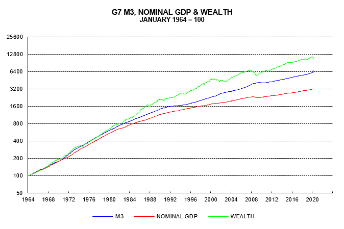
The first chart compares growth since the 1960s in G7 M3, nominal GDP and a wealth proxy encompassing equities, bonds and housing. M3 has outpaced nominal GDP but lagged wealth. Indeed, the ratio of M3 to nominal GDP approximately doubled in the 55 years between 1964 and 2019, while the ratio of M3 to wealth approximately halved. This suggests that income and wealth have been equally important in explaining rising demand for M3.

the-quantity-theory-of-wealth chart01

The “quantity theory of wealth” is a reformulation of equation (1) to incorporate explicitly the wealth effect on money demand:

MV* = (PY)0.5W0.5 = PYw0.5 (2)

where W = wealth and w = W/(PY) = the ratio of wealth to income.

If wealth rises at the same rate as income w is constant and the equation simplifies to (1).

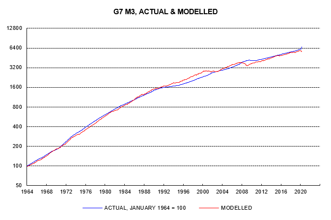
The second chart compares growth of actual M3 and modelled demand based on equation (2), assuming a constant value of V* equal to its full-period average.

the-quantity-theory-of-wealth chart02

Note that V* in equation (2), which could be termed “true” velocity, measures the sensitivity to money stock changes of income and wealth combined, rather than income alone. Dividing (1) by (2) and rearranging

V = V*w-0.5

showing that “conventional” velocity V is inversely related to the wealth to income ratio w.

The third chart compares the two velocity measures. The secular downward trend in conventional velocity V, as explained, reflects the secular rise in the wealth-to-income ratio. By contrast, there has been no trend in “true” velocity V* over the period as a whole. V* did, however, fall significantly during the tech bust (2000-03) and GFC (2006-09). These declines probably reflected cash “hoarding” due to heightened risk aversion, i.e. an additional demand for money unrelated to economic transactions or wealth. V* subsequently recovered in both cases, though not to prior peaks.

the-quantity-theory-of-wealth chart03

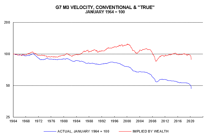
Following its post-GFC recovery, “true” velocity V* stabilised at close to its full-period average over 2013-19. The coronavirus crisis, however, has resulted in another drop, which is likely again to prove temporary.

Equation (2) can be rearranged to solve for the level of wealth W consistent with the current money stock M and nominal income PY:

W = (MV*)2/(PY) (3)

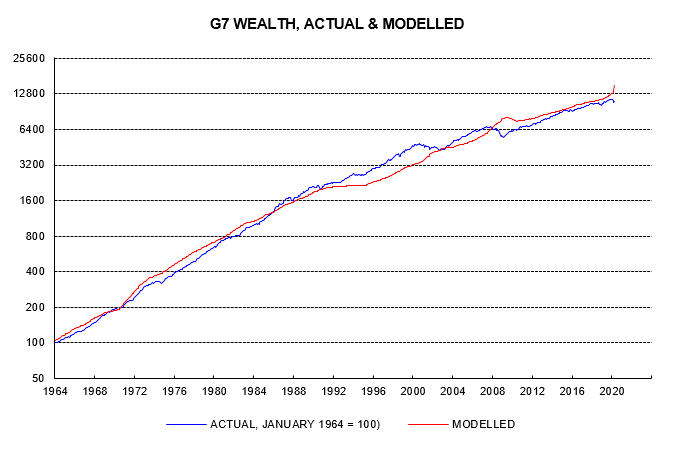
The fourth chart compares growth of actual wealth and the modelled level based on equation (3). Wealth overshot the modelled level significantly during the tech bubble of the late 1990s. The subsequent bust resulted in convergence but no undershoot. By contrast, equity and house price falls over 2007-09 pushed wealth significantly below the modelled level. Wealth has been close to but slightly below the modelled level in recent years but is now undershooting significantly again, reflecting monetary strength and weakness in nominal GDP and equity prices.

the-quantity-theory-of-wealth chart04


The consensus view that monetary acceleration will not feed through to stronger nominal GDP growth and / or asset prices assumes an offsetting large-scale increase in cash hoarding. The evidence presented above suggests that episodes of significant cash hoarding are infrequent and temporary. The long-term decline in conventional velocity mainly reflects a rising wealth to income ratio. If the consensus forecast of no rise in nominal GDP growth proves correct, the implication is a stronger, not weaker, medium-term path for asset prices and wealth.


These are the views of the author at the time of publication and may differ from the views of other individuals/teams at Janus Henderson Investors. Any securities, funds, sectors and indices mentioned within this article do not constitute or form part of any offer or solicitation to buy or sell them.

Past performance is not a guide to future performance. The value of an investment and the income from it can fall as well as rise and you may not get back the amount originally invested.

The information in this article does not qualify as an investment recommendation.

For promotional purposes.

The Synchronicity Chamber
"I am not yet tir'd of doing nothing."

David Hume Letter to Adam Smith, January 1766

"Let us try for once not to be right."

Samuel Rosenstock, aka Tristan Tzara, a French-Romanian poet and essayist.

"Dada Manifesto", 1918, translated by Robert Motherwell, in "Dada Painters and Poets".
Cheats and Deceits

How Animals and Plants Exploit and Mislead

Martin Stevens, Oxford University Press, February 2016

Bristlecone Pines and Markets

Bristlecone Pines do very well where most other plants cannot even grow. What would be the equivalent in today's markets?

Markets, Time and Unusual Events
The Great Crash, Depression, Deflation and FDR

DJIA, 1929 - 1940

Japanese markets across a century of events

1900 - 2000

Nominal and Real Returns on Japanese Asset Classes

Swiss markets across a century of events

1900 - 2000

Nominal and Real Returns on Swiss Asset Classes
The Russian Stock Market Before the Revolution

"Russian stocks advanced more in price than American stocks between 1864 and 1914, but American companies paid larger dividends. Price and dividends offset each other and during that 45-year period, the two stock markets provided approximately equal returns."

Dr. Brian Taylor, Global Financial Data, 21 March 2018

  • About
  • Disclaimer
  • Privacy Policy
  • Cookie Policy
  • Contacting Us